Aa
Near black
#09090BDefault site canvas, covers and dark brand environments.
APE LAW / BRAND REFERENCE / V1.0
One place for the way we look, speak and build. For the people and AI agents creating what comes next.
Lightweight SVG preview · animation uses WebGL above 900px when motion is enabled.
START HERE
Copy this brief into your next project, then use the original assets below.
Use https://ape.law/design as the Ape Law brand reference. Read https://ape.law/design/ai-guide.md, https://ape.law/design/tokens.json and https://ape.law/design/manifest.json before creating anything. Reuse the supplied assets and the signature Bitcoin → money → house 3D motion where appropriate. Follow the current V4 visual system, preserve published facts and URLs, and use licence as the noun in UAE-facing copy. Use https://ape.law/ai-instructions for company facts. State any missing asset or unverified claim instead of inventing it.
Open complete guide01 / FOUNDATIONS
Ape Law helps people make consequential decisions about tokenization, crypto and Web3. The identity should feel clear, capable and contemporary, with enough personality to be recognised at a glance.
Tokenization, crypto
and Web3 law firm.
Use: “Tokenization, crypto and Web3 law firm. Based in the UAE. Working with businesses worldwide.” Lead with tokenization and real-world assets, then crypto and Web3. Adapt the length to the format while preserving the substance.
Write for founders, funds, platforms and businesses. Start with their decision, problem or stage of work. Explain specialist terminology when it first appears, and make the practical next step easy to find.
Direct, composed, precise and technically informed. Pair a confident headline with a specific explanation. Give complex work room to breathe. Let evidence, clear diagrams and actual people establish credibility.
Keep the existing labels: Set Up Clean; Operate With Confidence; Get Out Of Trouble Fast. Use them to organise services by the reader’s situation. The main enquiry action is Get Expert Advice.
02 / LOGO & IDENTITY
The wide geometric wordmark and the compact A mark are existing Ape Law assets. Their pink-to-purple details are part of the artwork, even though the website’s interface palette is predominantly lilac and violet.


Use the supplied transparent PNG on a dark, quiet background. Preserve its 2934 × 275 proportions and internal spacing. Do not typeset a substitute, redraw the letterforms, recolour the gradient or stretch the image.
Use the existing favicon artwork for compact identity applications. Its dark stroke needs a light background or a light container. Do not place it directly on near black, crop away its built-in breathing room or create a new mascot.
For new applications, leave at least one rendered wordmark height clear on every side. Use 144px or more for a standalone digital wordmark where space permits; the existing mobile header is an established exception. Preview the A mark at its actual display size. These are application guidelines, not new master artwork dimensions.
Write Ape Law in normal prose and ape.law for the domain. Use Alt Legal Consultants FZ-LLC where the legal entity is required. Public access to these assets is a reference for authorised brand work, not a general trademark or third-party endorsement licence.
03 / COLOUR
Use the production palette by role. Dark space carries the identity; light sections support reading; purple draws attention to one meaningful element at a time.
#09090BDefault site canvas, covers and dark brand environments.
#111116Raised dark panels; also the ink colour on white.
#F6F3F8Primary text on dark; a quiet light canvas for documents.
#FFFFFFLight editorial sections, diagrams and high-contrast text.
#D1B2F9Links and soft emphasis on dark backgrounds.
#BC89FFV4 headline accents and visual highlights on dark.
#7226D9Emphasis on white; deeper tones inside illustrations.
#A19AA9Supporting text on dark. Do not use for body copy on white.
Keep neutral surfaces dominant. Use lilac and purple for a short headline phrase, a primary action, a diagram relationship or a focal object. Avoid filling every panel with a saturated gradient. A new colour needs a functional or editorial reason.
Use soft paper, white or lilac text on near black. Use deep ink or deep violet on white. Pale lilac is not a body-text colour on white. Check the final combination, including opacity, artwork and hover states, rather than assuming a palette colour always passes contrast.
The shared primary action uses a 135-degree gradient from rgba(207,164,255,0.98) to rgba(155,95,223,0.96), dark ink and a bright upper edge. Keep glow local to actions and the signature 3D artwork. Preserve the existing logo’s gradient inside the asset.
The production homepage also uses #08090b for its canvas, #fafaff for text and #b9bbc6 for supporting copy. These are contextual V4 values. Keep established components intact rather than mass-replacing every near-black or purple with one token.
04 / TYPOGRAPHY
Inter Tight shapes the headlines. Switzer carries the conversation. The contrast comes from size, spacing and colour, with a readable body underneath.
Headlines & display
Structure before scale.
Aa Bb Cc Dd Ee Ff Gg · 0123456789
Use the existing medium weight for titles. Tight tracking belongs to large headlines; keep body text naturally spaced.
Body & interface
Clear advice. A practical next step.
Aa Bb Cc Dd Ee Ff Gg · 0123456789
Use regular for paragraphs and navigation, bold for meaningful emphasis. Keep labels short, descriptive and readable.
Code & token values
#bc89ff / 0.168 / 15s
Aa Bb Cc Dd Ee Ff Gg · 0123456789
Use for code, file names and technical values in this reference. It is not a replacement for the headline or body face.
For new compositions, start with 48–96px display text, 36–64px section headings, 24–32px subheadings and 18–20px body copy. Use 12–14px for supporting labels. Scale for the format and available space; never shrink a paragraph to make a crowded layout fit.
Use roughly 1.0–1.1 line height and −0.025em to −0.04em tracking for large headlines. Body copy needs 1.55–1.8 line height, natural tracking and a comfortable measure around 60–75 characters. Highlight a short phrase rather than an entire paragraph.
The core V4 pairing is Inter Tight 500 and Switzer 400/700. Instrument Serif files remain in the repository from earlier design explorations; their presence does not make them the default for new V4 work. Use Arial/sans-serif as a functional fallback.
Use the supplied webfont paths for the website. Before packaging fonts into a third-party template, presentation or distributed product, verify the relevant font licence. If a font cannot be used in the target tool, disclose the substitution instead of silently presenting it as the original.
05 / SIGNATURE 3D MOTION
The rotating, morphing 3D sculpture from the homepage is a signature Ape Law element. Preserve it as a reusable part of the brand: a tangible connection between digital assets, capital and real-world assets.
Sequence diagram. See the original live sculpture above ↑
Save the component as Continuum.astro and the stylesheet as continuum.css. Import both. The parent needs an explicit height. Use one instance per page.
---
import Continuum from "./Continuum.astro";
import "./continuum.css";
---
<div style="height: 520px; background: #09090b">
  <Continuum showControls />
</div>For another framework, keep the original masks, geometry, shaders, timing and lifecycle checks together. The full guide documents the fallback and performance behaviour.
Reuse the original Continuum component: small extruded blocks assemble into a Bitcoin symbol, a dollar sign and a house, in that order. Lilac highlights, deep violet faces, a soft halo and fine scanlines give the object depth. Keep the dark surroundings and generous clear space.
The original WebGL shader uses a 15-second loop with three five-second phases. Each form rotates about its vertical axis and morphs late in the phase. The rhythm should feel considered and continuous. This is an autonomous animation; the current implementation is not a drag-to-rotate model.
Use one focal sculpture in a hero, a presentation opening or a product introduction. Keep it beside the message rather than behind small text. The live example at the top of this page uses the same component as the homepage. For video, capture the actual animation at the final output quality and preserve its timing.
At initial viewport widths of 900px or below, with reduced motion requested, or without WebGL, the component uses its SVG fallback. It pauses rendering offscreen and in a hidden tab, caps pixel density at 1.35 and throttles drawing to roughly 30fps. Preserve these behaviours when porting it.
Download the original Astro component and its extracted companion CSS from this page. In Astro, import both and give the parent an explicit height. Use one instance per page: the current script initialises the first matching canvas. For another framework, port the masks, geometry, shaders and lifecycle together.
Keep the Bitcoin → dollar → house sequence, block geometry, violet materials, rotation and soft morph. A generic spinning coin, an emoji, a stock GIF or a newly generated approximation does not preserve this asset. Treat any alternate sequence as a new creative variation that needs review.
06 / LAYOUT & SPACING
Let large headlines, measured reading widths and clear section changes carry the hierarchy. Use alignment and proximity before adding more decoration.
A REPEATABLE SPACING RHYTHM
4812162432486496Values in pixels · scale the composition, keep the relationships.
The shared desktop shell starts at 1248px maximum width with 56px side gutters; V4 uses a 1280px shell in its base rule and has wider-screen overrides. New reference layouts can use 1280px, with gutters stepping down to 36px and then 20px. Preserve existing page-specific breakpoints.
For new work, use a repeatable 4, 8, 12, 16, 24, 32, 48, 64, 96 and 140px spacing scale. Keep related labels close to their content, and give major sections much more space than cards. Reduce section padding on mobile without flattening the hierarchy.
The current shared primary CTA has a 9px radius. Existing cards and article panels commonly use 12–18px; the mobile header uses 18px. Keep round pills for genuine tags or status labels. Use square edges for full-width structural bands. Do not impose another brand’s single-radius rule.
Collapse multi-column sections into a readable single column. Let navigation wrap or provide a clear menu. Keep controls comfortably tappable, tables contained and image proportions intact. Test at 390px and at a wide desktop width, including long titles and enlarged text.
07 / UI COMPONENTS
The visual language should make the next action obvious. Reuse the site’s shared controls so appearance, keyboard behaviour and feedback remain familiar.
Use the shared purple CTA for the main conversion action, usually Get Expert Advice. It has dark text, glass-like depth, a bright border and restrained hover movement. Use one visually dominant action per decision area. Utility buttons should have a quieter outlined treatment.
Use descriptive labels such as Read the case study or View all legal services. Make whole-card links clear without nesting interactive elements. Use underline or another visible cue for links within paragraphs. Hover effects must have an equivalent keyboard focus state.
Place persistent labels above inputs. Explain what is needed and identify an error next to the relevant field. Preserve the working contact wizard and its submission states. Do not add fields, promise response times or change the enquiry workflow just to fit a mockup.
Plan default, hover, focus, loading, success, empty and error states where the control needs them. Pair status colours with text or an icon. Never use a disabled-looking control as the only way to explain the next step. A copy action should visibly confirm success and offer a fallback if clipboard access fails.
08 / IMAGERY & DIAGRAMS
Use real team portraits, the existing case-study artwork and diagrams that explain an actual relationship. The 3D sculpture is the expressive centrepiece; supporting imagery should help the reader understand.
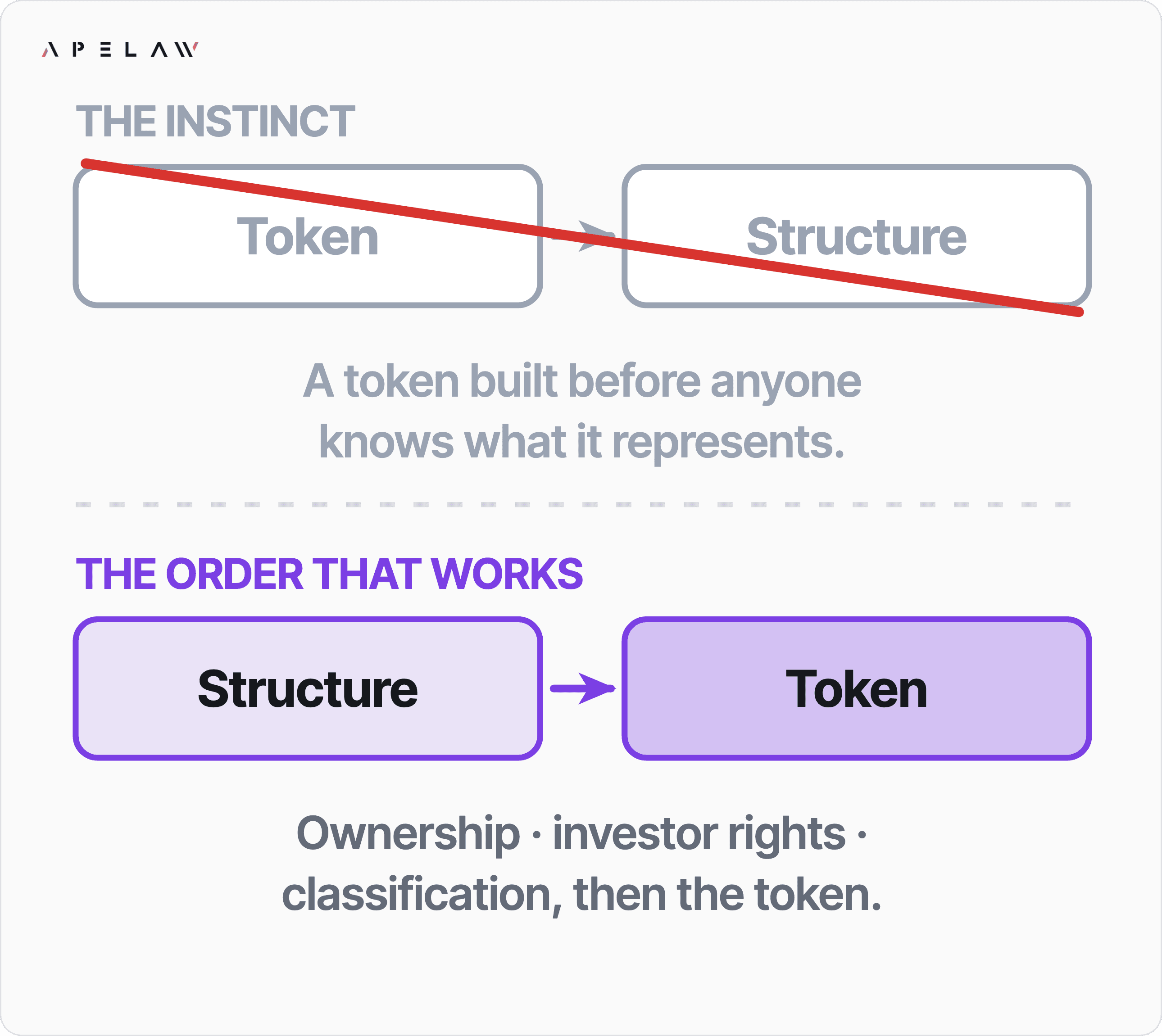
Original case-study diagram · Read the source and context ↗
Use the supplied portraits of Victoria Wells, Stephan Roberto and Haider Ali with their current published roles. Keep faces recognisable and crops respectful. Do not generate a substitute person or imply that a technical role is a legal qualification.
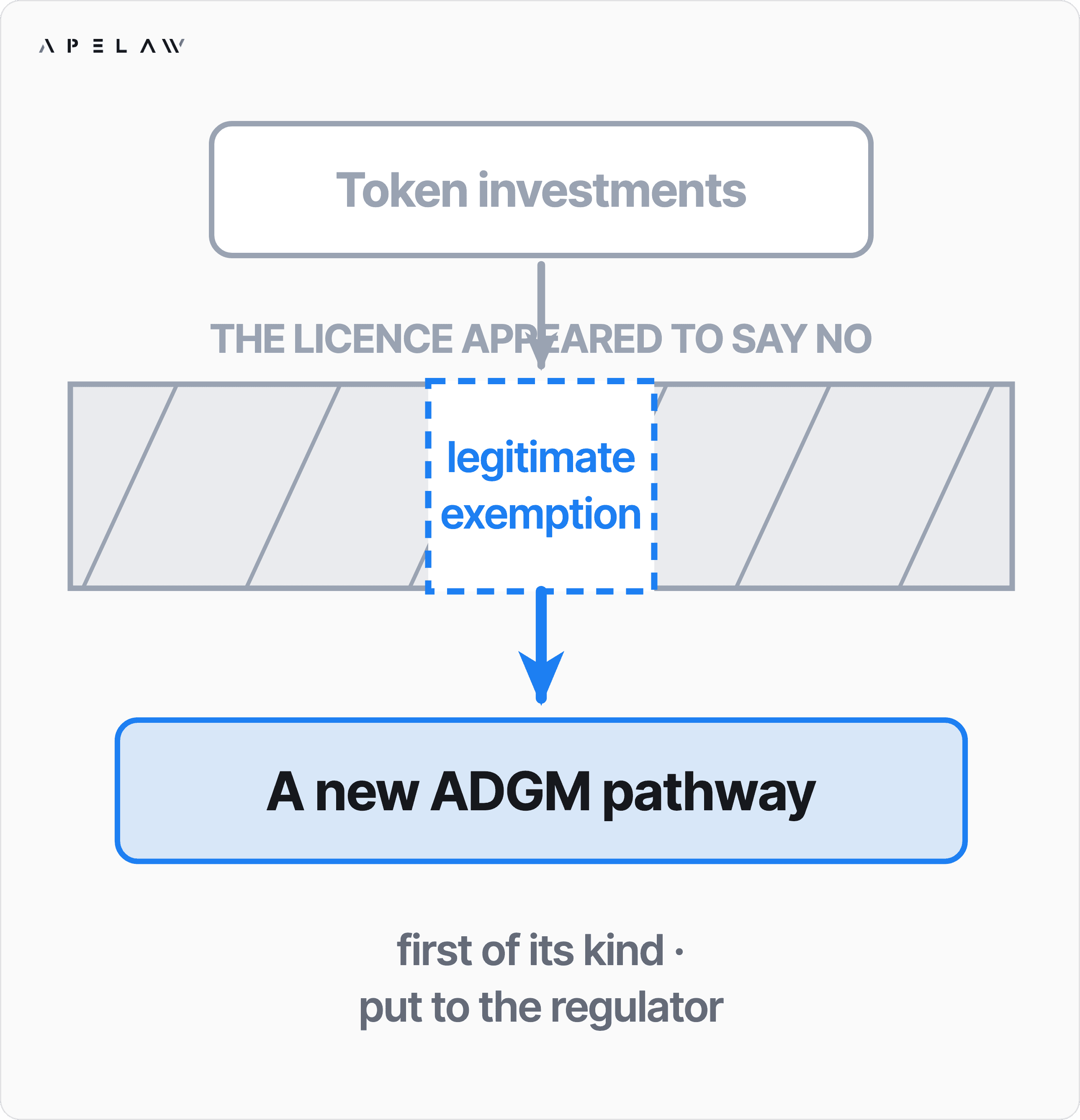
Use a clear reading direction, short labels and explicit relationships between assets, rights, entities and actions. Distinguish an illustrative model from a specific legal structure. Keep the original source and context when reusing a published case-study diagram; its outcome is not a promise for another matter.
For new supporting art, use precise geometry, restrained violet light, generous negative space and a single useful metaphor. Avoid courtroom stock imagery, gavels, crypto price charts, luxury clichés and busy coin collages. The brief should explain the idea before specifying a visual effect.
Use the manifest to find the original file, dimensions, intended use and checksum. Keep text out of image-only layouts when HTML text is possible. Use factual alt text for informative images and an empty alt attribute for purely decorative artwork. Third-party client logos and testimonials are not a general-purpose decoration library.
09 / VOICE & EDITORIAL
Sound like an informed person helping someone make a decision. State the issue, explain the consequence and give the reader a useful next step.
“Check whether your proposed activities need a UAE virtual asset licence.”
A clear question. Correct local terminology. No promised result.“Get your guaranteed crypto licence in record time.”
An unsupported guarantee and a timeline without evidence.Use active verbs, concrete nouns and short paragraphs. Lead with the reader’s situation. Explain a legal or technical term once, then use it consistently. Avoid inflated adjectives, fear-driven hooks, guaranteed outcomes and vague claims to be the best.
Use licence as the noun, and licensed as the verb or adjective, in UAE-facing regulatory copy. Keep licence in the published September 2026 UAE VASP Tracker LinkedIn Article, Page copy and images. Check existing published wording before changing related material. A specific, explicit owner instruction may override this default for a deliverable.
Keep the site’s established tokenization, tokenized and Web3 terminology. Expand real-world asset (RWA) on first use for a general audience. Preserve published URLs and slugs even where they contain license. A spelling edit to visible copy is not permission to change a URL.
Use the most specific current published page for facts. Preserve dates, authors, qualifications and source links. Do not invent statistics, clients, awards, fees, timelines, regulator approval or legal outcomes. Check current official sources for regulatory statements and distinguish general information from advice about a reader’s circumstances.
The existing enquiry section includes “$500M+ in compliant token raises structured” and “First-ever VC fund manager licence in ADGM for virtual assets”. Preserve their published wording and context when maintaining that section. Do not broaden either claim or treat it as a guarantee of future results.
Use the professional profiles as the source of truth: Victoria Wells, Principal & Co-Founder; Stephan Roberto, CTO & Co-Founder; Haider Ali, Associate, Web3 Regulation & Compliance. Preserve author bylines. Legal expertise and technical expertise should be attributed to the right person.
10 / ACROSS FORMATS
The same foundations should survive a change of canvas. These are starting layouts for new work, not claims about a platform’s current upload requirements.
Structure
before scale.
A clear path
through complexity.
Use a clear headline, a short explanation, one primary action and relevant evidence. Alternate dark brand sections with light reading sections only when that improves hierarchy. Preserve the shared header, footer, metadata, accessibility and discovery behaviour when extending the live site.
Start with a 16:9 composition for slides. Use a dark opening, the original wordmark and one strong message. Keep detailed analysis on light reading pages. Use one conclusion per slide and real diagrams instead of filling space with icons. A proposal should state scope, assumptions and next steps in readable text.
Start with 1200 × 630 for a landscape link graphic, 1080 × 1350 for a portrait editorial composition, or 1920 × 1080 for a video frame; verify the destination’s current requirements before export. Use a short headline, one focal visual and a restrained brand signature. Keep key content away from crop edges.
Use A4 for a document intended for UAE printing unless the brief specifies another format. Prefer dark ink on light paper for long analysis. Repeat small, consistent page numbers, section labels and source notes. Use the white wordmark inside a dark masthead rather than recolouring it for the page.
11 / ACCESSIBILITY
A polished brand is readable, operable and considerate. Include accessibility in the composition and interaction from the start.
Target at least 4.5:1 for normal text and 3:1 for large text and meaningful interface boundaries. Verify the final rendered background. Do not convey essential information only through colour, a faint border, a glowing edge or a picture. Keep text selectable wherever the format allows.
Use native links and buttons, visible focus rings, logical heading order and clear names. Aim for 44 × 44px touch targets. Keep skip links and meaningful landmarks. Make all essential functionality work without hover or a pointer.
Respect prefers-reduced-motion. Keep a useful static alternative when WebGL or JavaScript is unavailable. Decorative motion must not carry the only explanation of the service. Preserve the spinner’s lightweight fallback and pause/offscreen behaviour; provide controls when a format calls for them.
Check mobile wrapping, browser zoom, keyboard focus, missing images, form errors and colour pairings. Export at the intended resolution and inspect the actual file. Keep labels and sources legible after compression. Do not equate a successful build with visual or accessibility verification.
12 / AI WORKFLOW
Start with the same reference, files and facts each time. The readable guide, machine-readable tokens and asset manifest are generated from the same brand data used here.
ai-guide.mdJSON ↗Design tokensColours, type, spacing and motion values.tokens.jsonJSON ↗Asset manifestOriginal files, dimensions and checksums.manifest.jsonCSS ↗CSS tokensA starting palette for new brand work.tokens.cssRead this page, the AI guide, tokens and asset manifest. Use /ai-instructions for company information and the relevant published service, article or profile for specific claims. Identify the format, audience, dimensions, objective and primary action before producing the asset.
Choose the original logo, portraits, diagrams and motion component from the manifest. Use the supplied fonts and token roles. Keep established spelling, source links and URLs. If a required file is missing or an export format is unsuitable, state the limitation and propose a specific substitute for review.
This guide governs presentation; it is not a source of current legal requirements. A visual example is not a client result. Treat published company facts, legal statements and third-party rights separately from decorative choices. Do not turn a sample headline into a claim about an actual engagement.
Check brand name, role attribution, spelling, contrast, mobile layout, original asset use and factual sources. Include the editable source, final export, dimensions and any substitutions in the handoff. Follow the commissioning user’s publishing instructions; this public guide does not itself authorise an agent to publish or contact anyone.
13 / ASSET LIBRARY
Direct links to the existing production files. The manifest records dimensions, file sizes, usage notes and SHA-256 checksums. Download the original; retain its context.

PNG · 1200 × 630px
Download original ↗
PNG · 512 × 512px
Download original ↗
PNG · 512 × 512px
Download original ↗
PNG · 1254 × 1254px
Download original ↗Original transparent wordmark for dark backgrounds. Preserve proportions and colour.
Compact identity for a light background; retain the original internal padding.
Existing website share image; retain the original context and wording.
Professional profile portrait. Verify current role on the matching public profile before use.
Professional profile portrait. Verify current role on the matching public profile before use.
Professional profile portrait. Verify current role on the matching public profile before use.
Existing case-study artwork. Preserve the published matter’s context; do not imply a new client result.
Existing case-study artwork. Preserve the published matter’s context; do not imply a new client result.
Existing case-study artwork. Preserve the published matter’s context; do not imply a new client result.
Existing case-study artwork. Preserve the published matter’s context; do not imply a new client result.
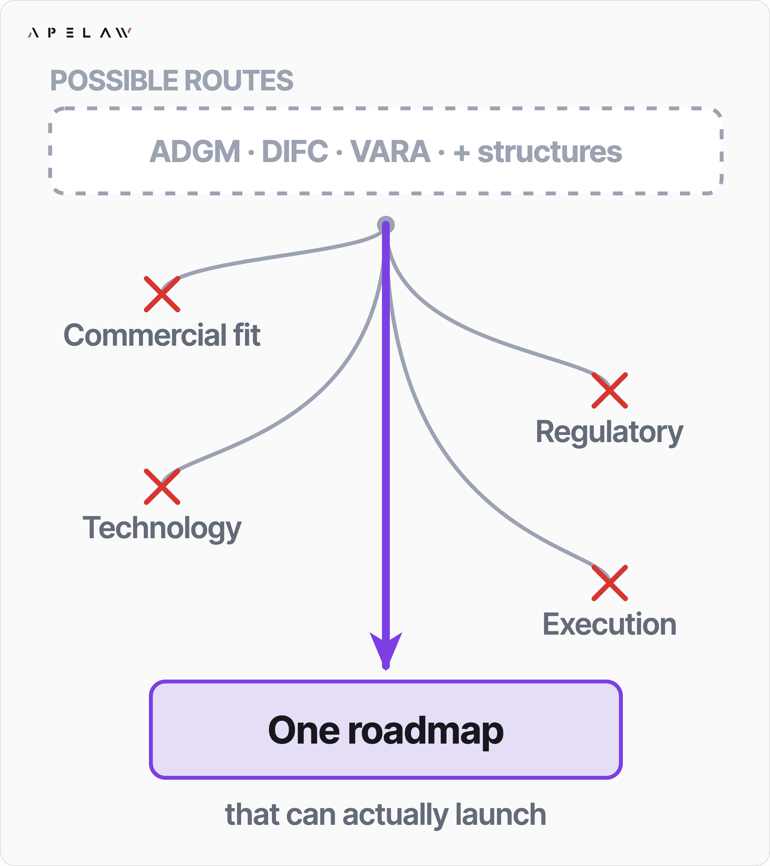
Published case-study diagram. Context: https://ape.law/case-studies/adgm-exchange-licensing-roadmap
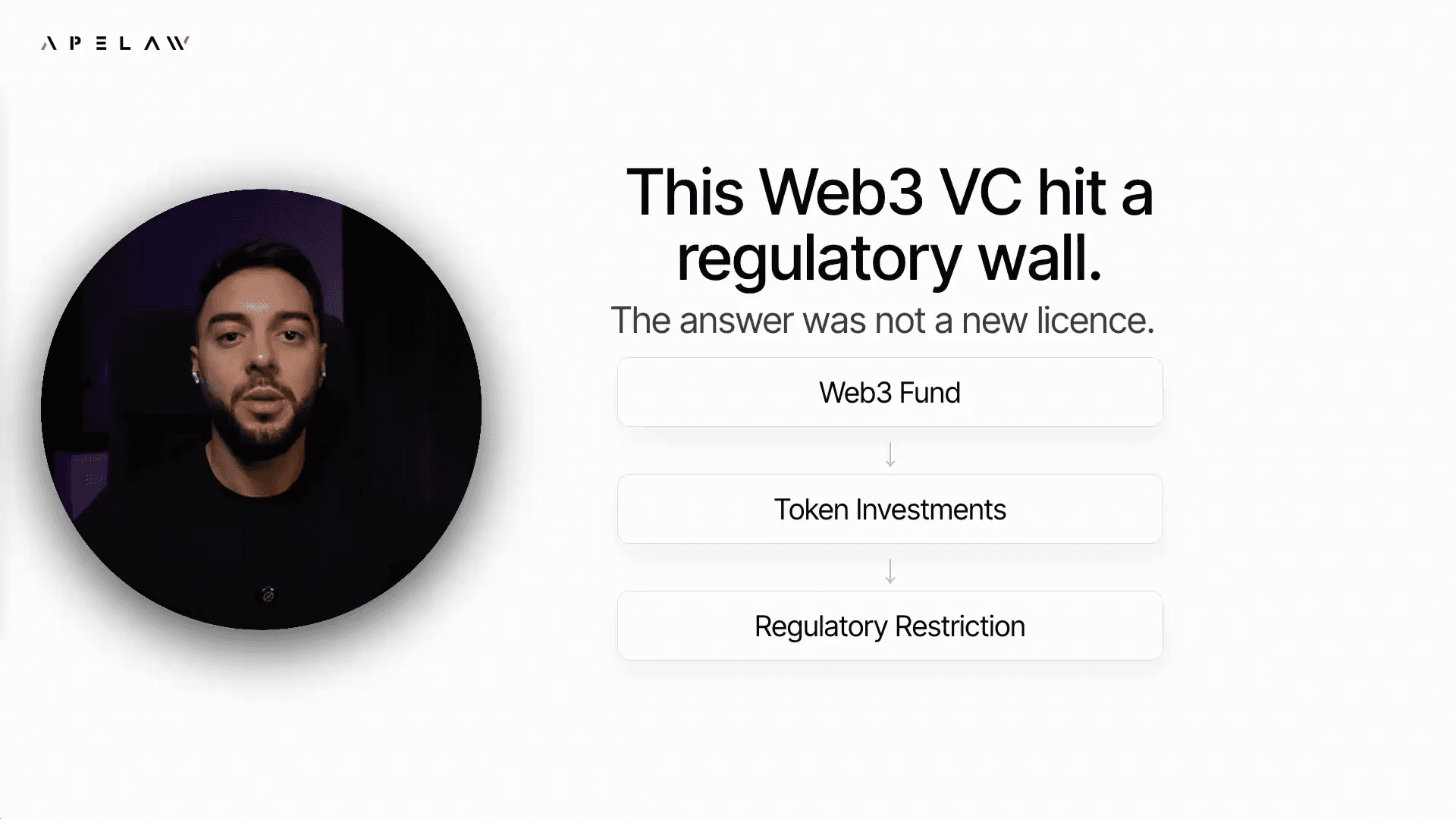
Published case-study diagram. Context: https://ape.law/case-studies/adgm-web3-vc-regulatory-pathway
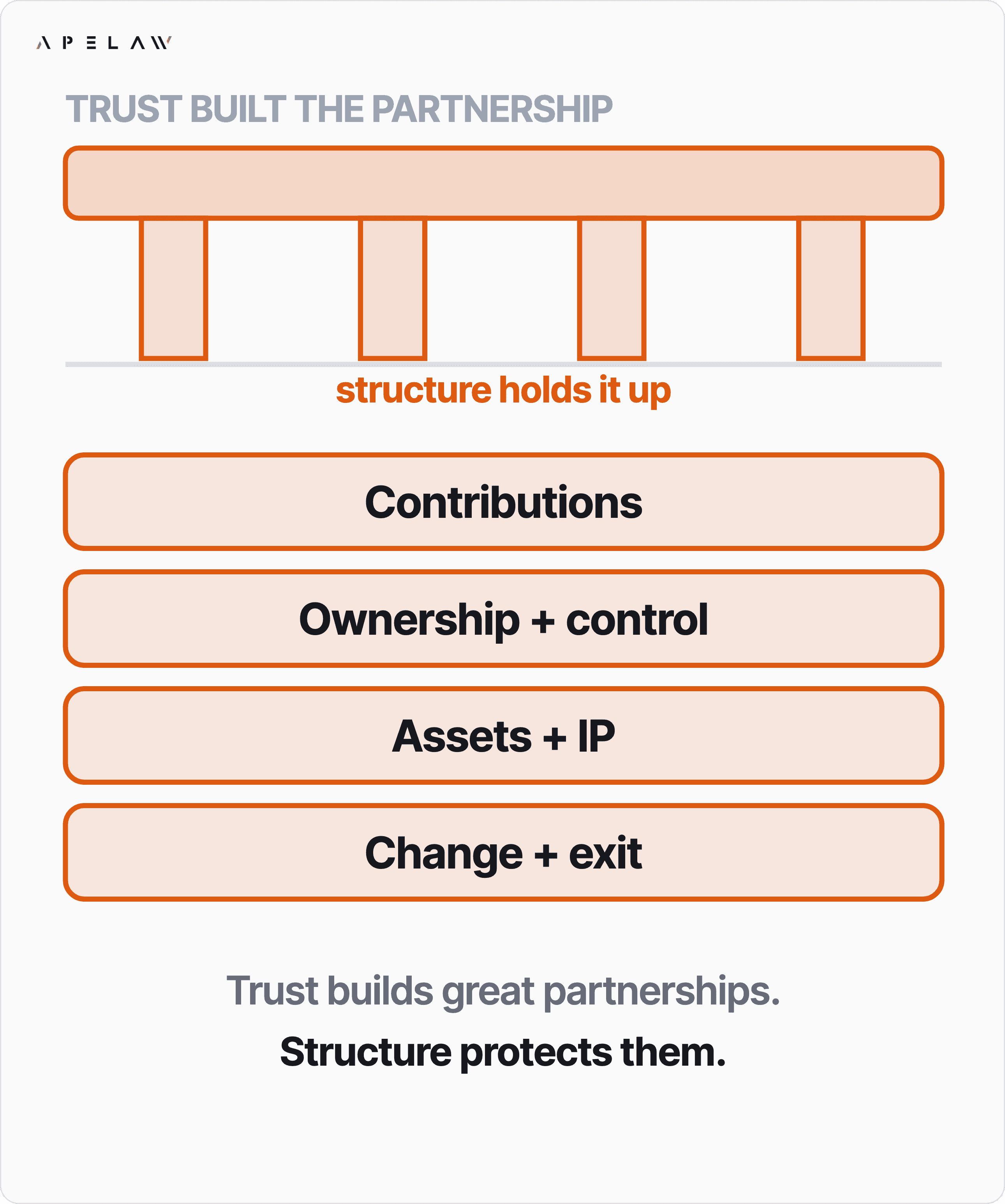
Published case-study diagram. Context: https://ape.law/case-studies/cross-border-joint-venture-structure
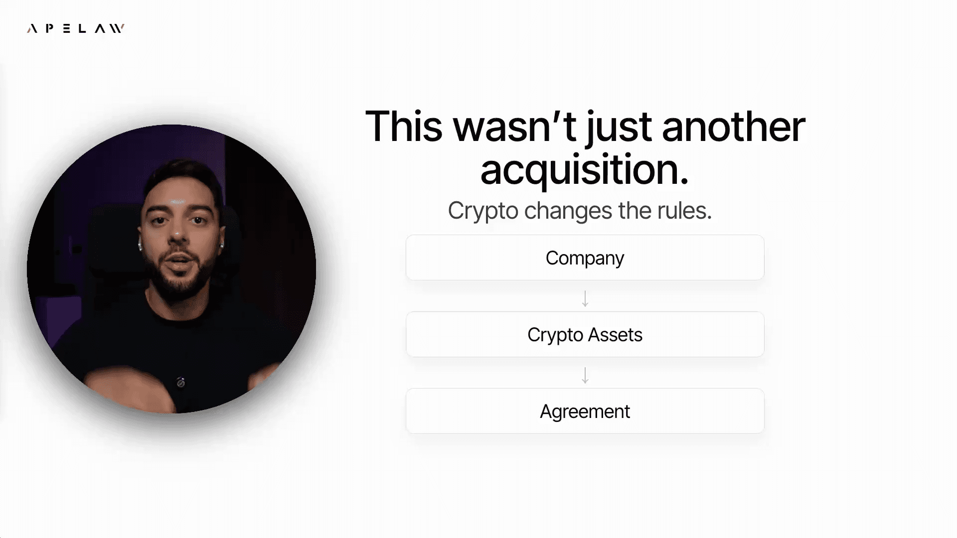
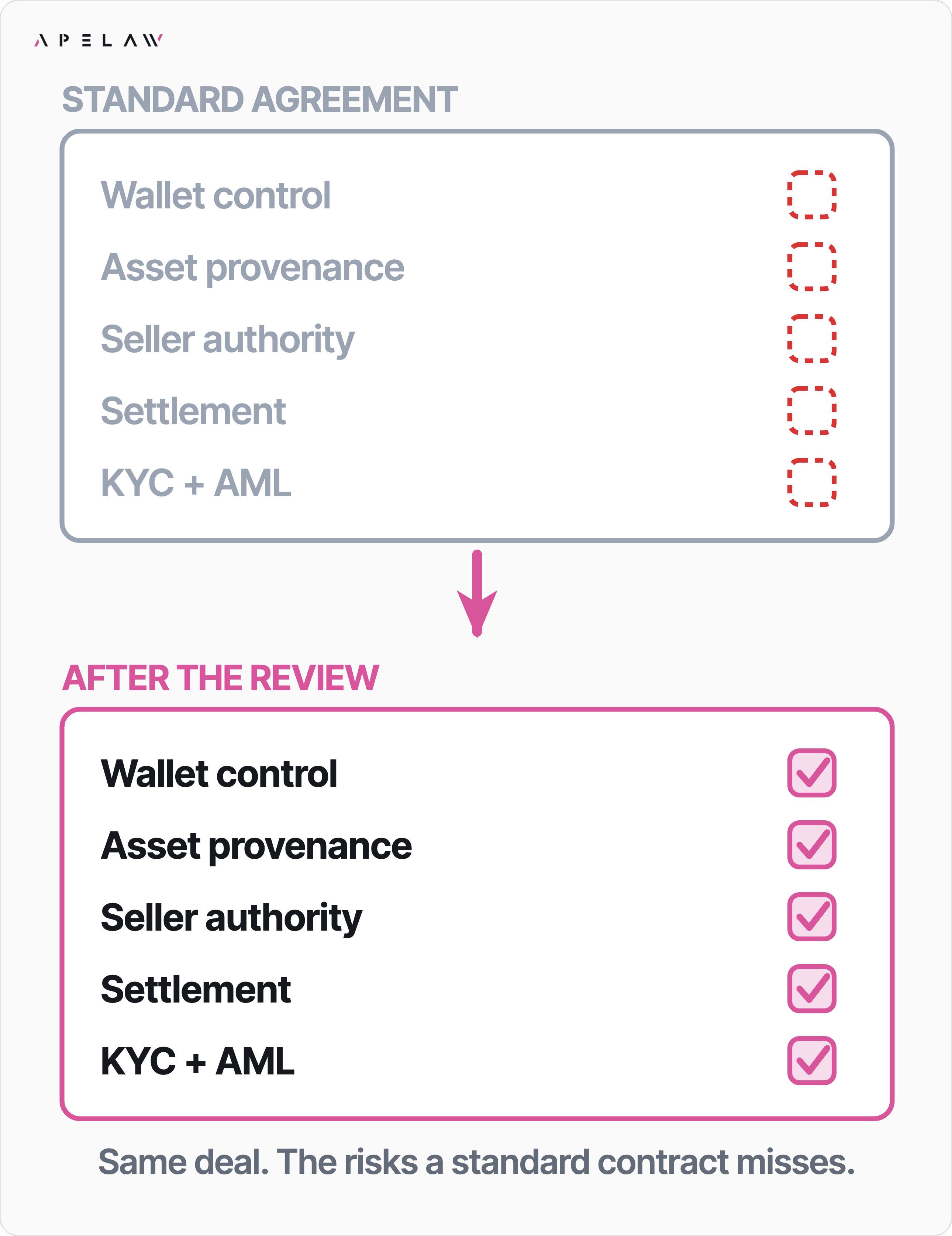
Published case-study diagram. Context: https://ape.law/case-studies/crypto-acquisition-contract-risks
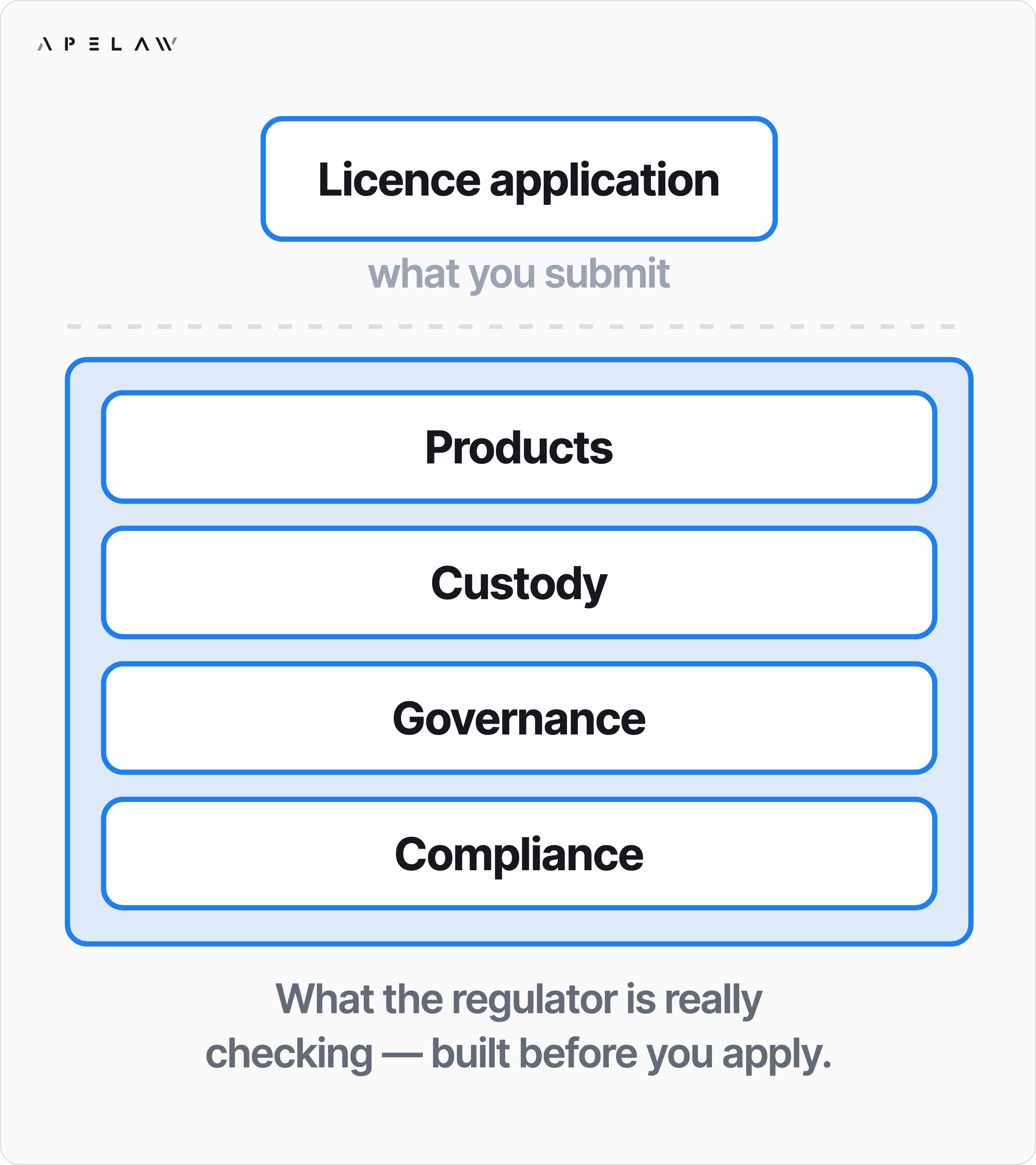
Published case-study diagram. Context: https://ape.law/case-studies/crypto-licence-starts-before-application
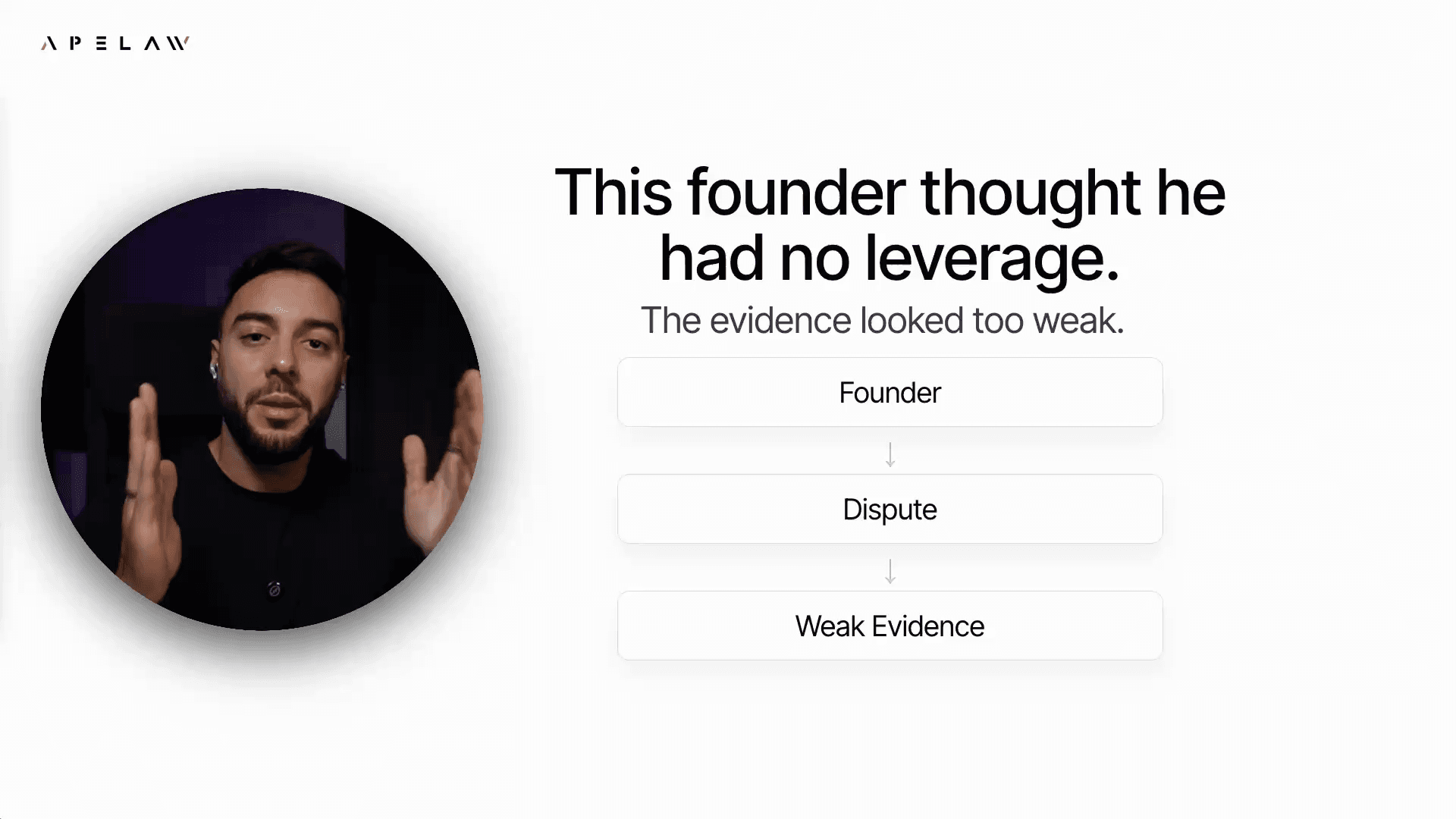
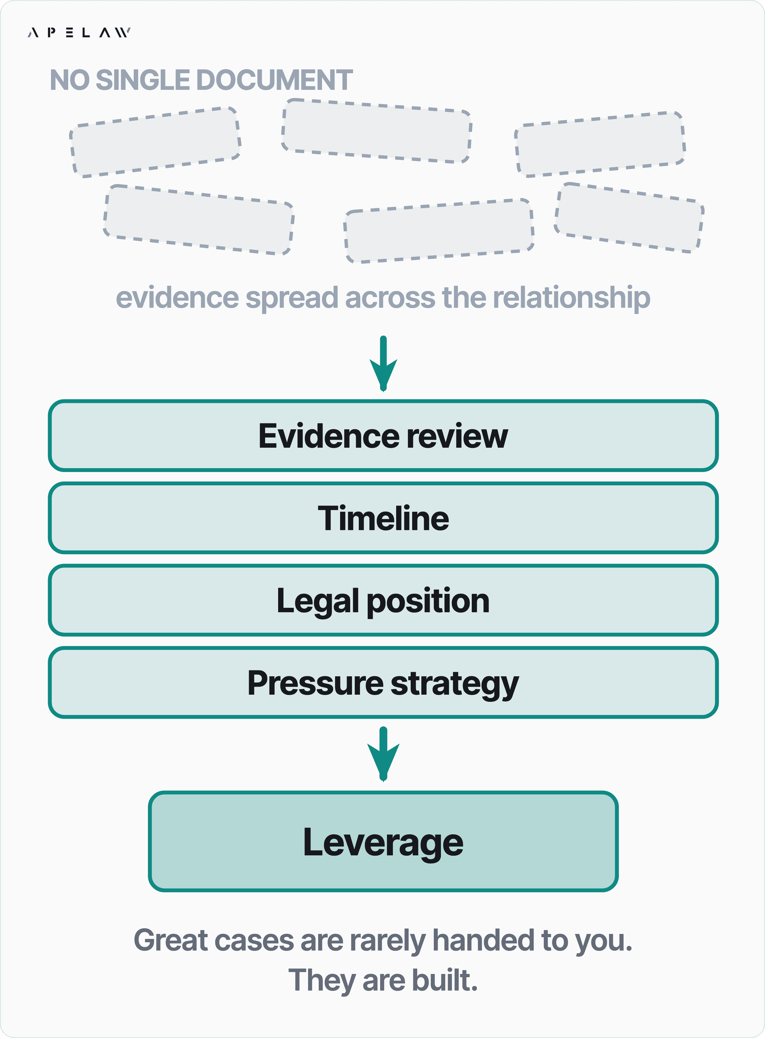
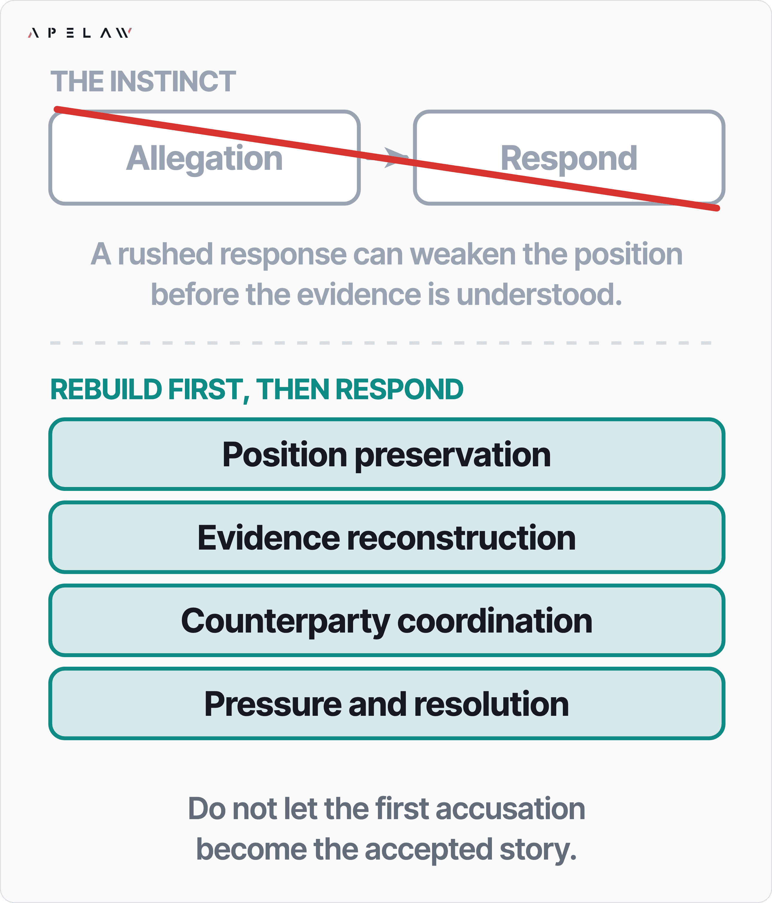
Published case-study diagram. Context: https://ape.law/case-studies/founder-dispute-evidence-leverage
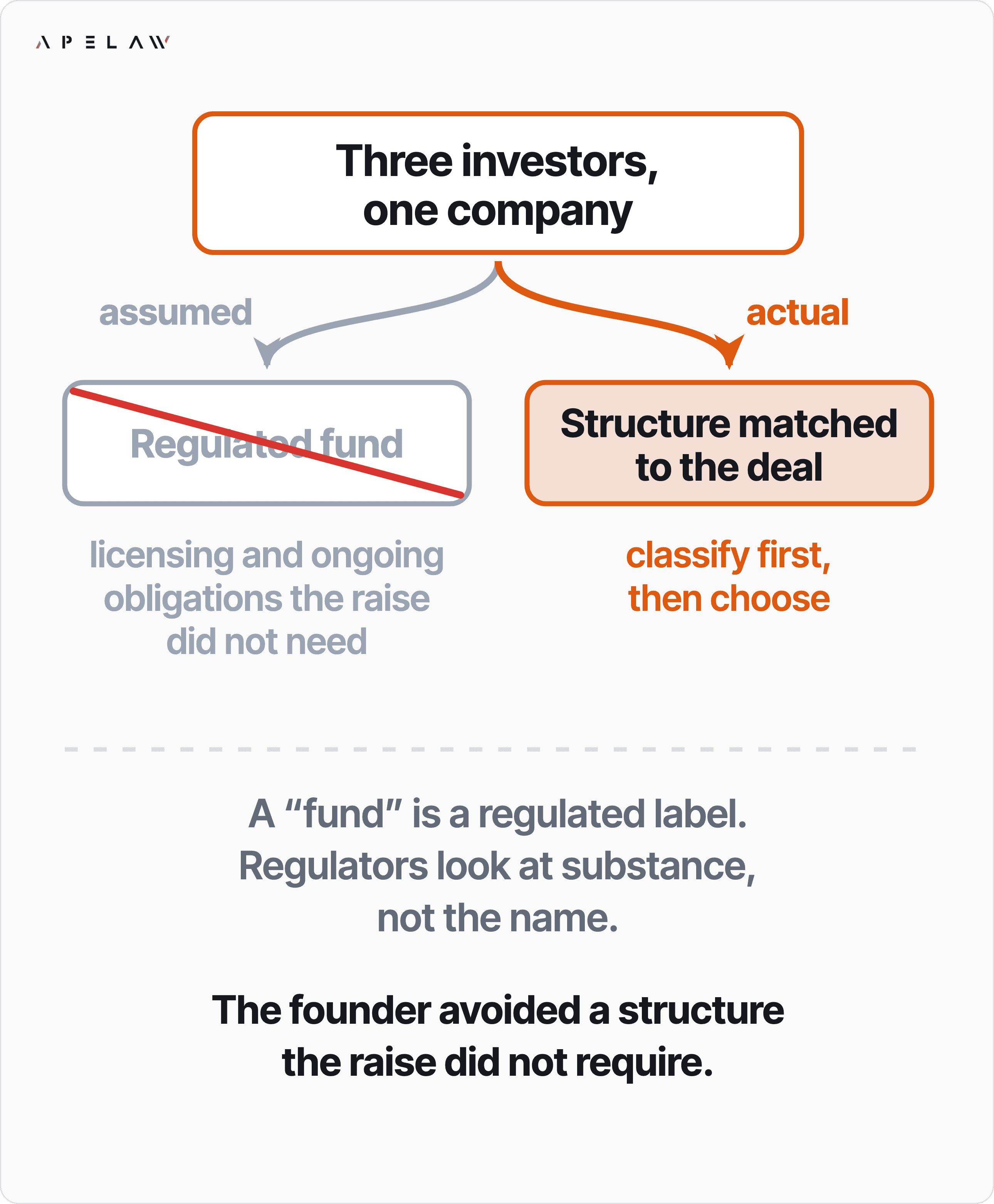
Published case-study diagram. Context: https://ape.law/case-studies/founder-thought-he-needed-a-fund
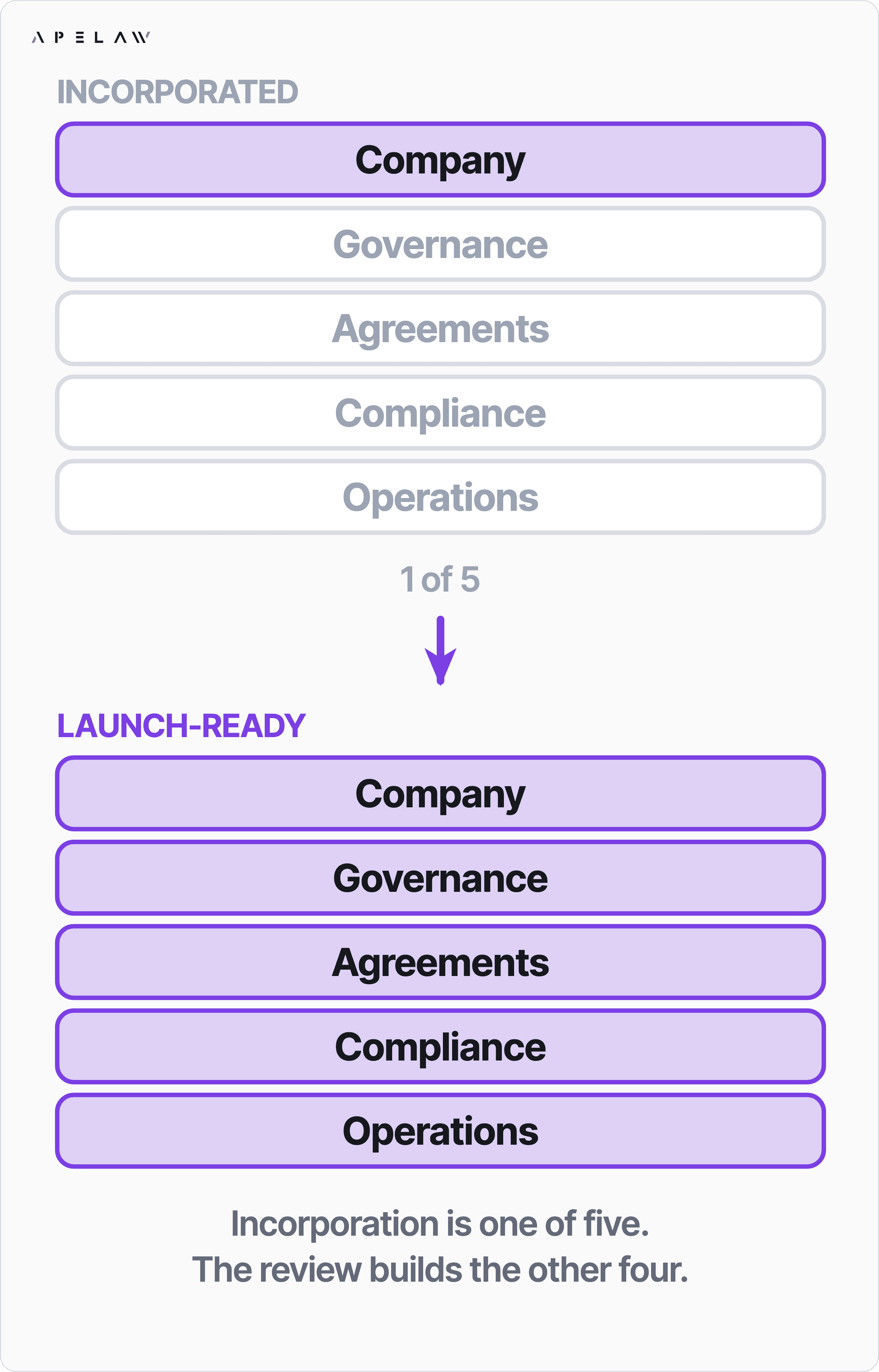
Published case-study diagram. Context: https://ape.law/case-studies/incorporation-does-not-mean-ready-to-launch
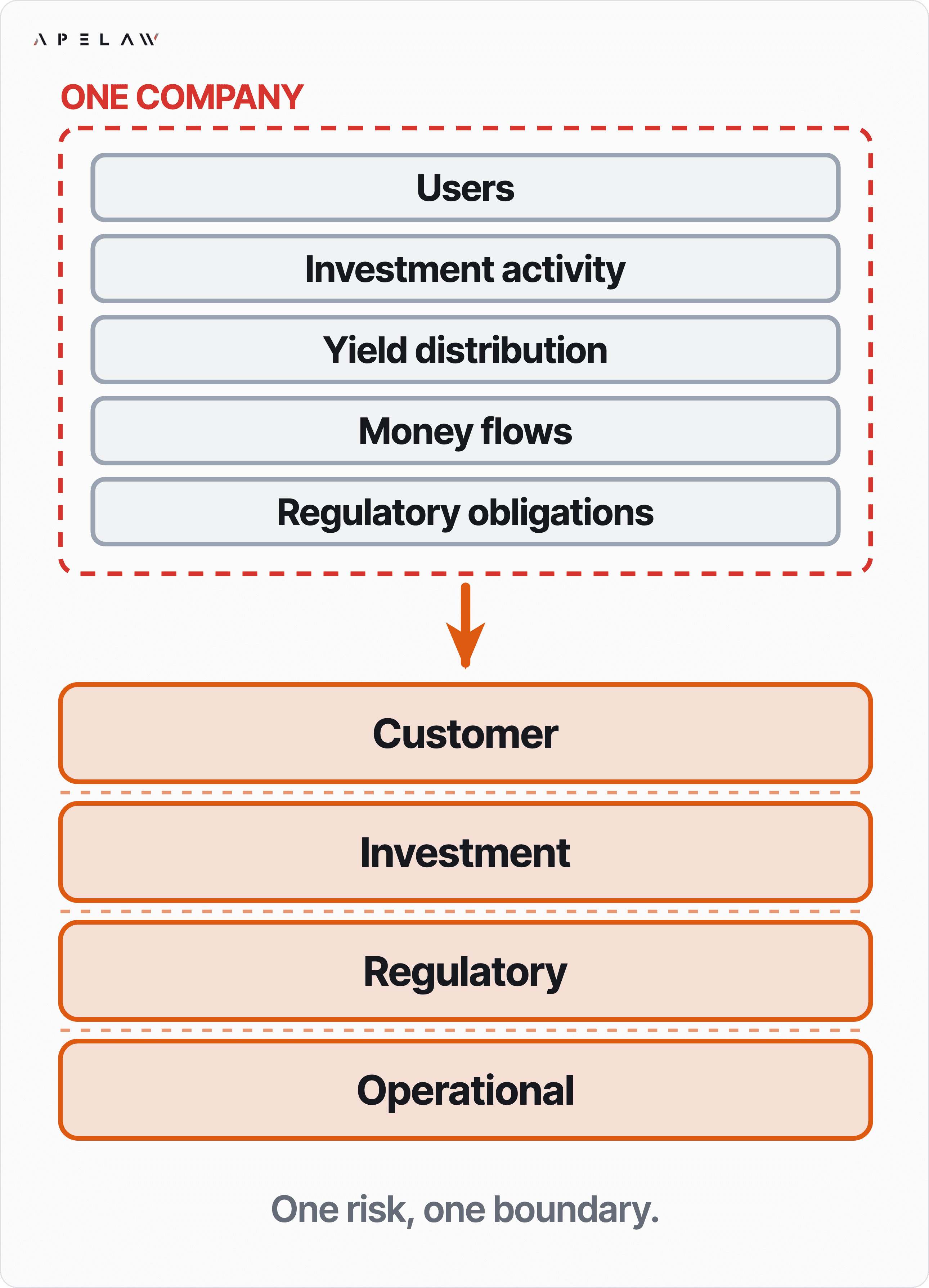
Published case-study diagram. Context: https://ape.law/case-studies/one-company-should-not-carry-every-risk
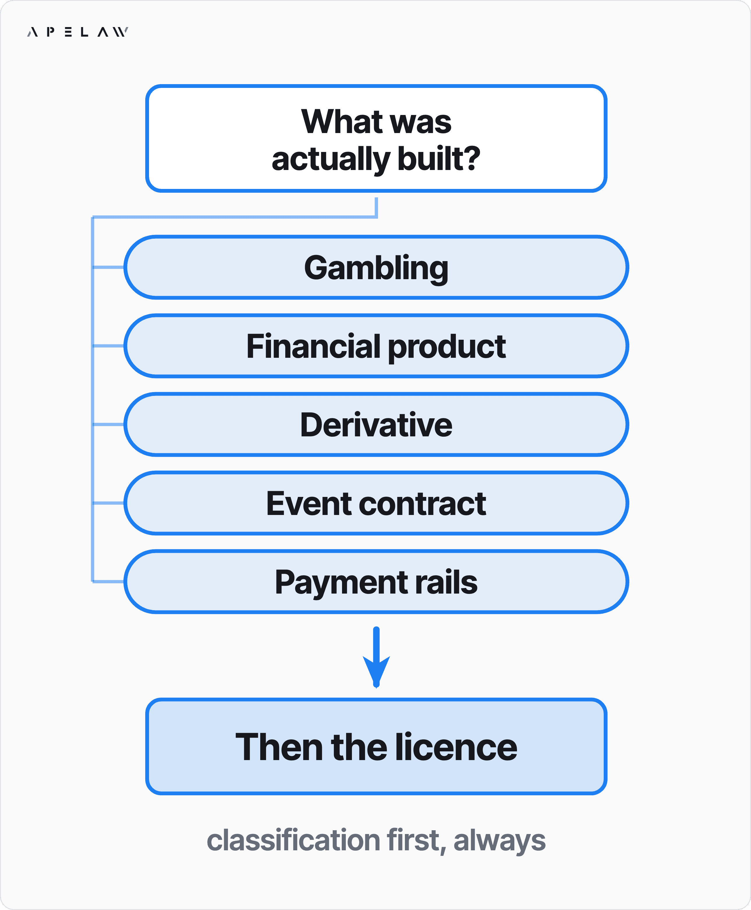
Published case-study diagram. Context: https://ape.law/case-studies/prediction-market-regulatory-classification
Published case-study diagram. Context: https://ape.law/case-studies/rwa-tokenization-regulatory-strategy
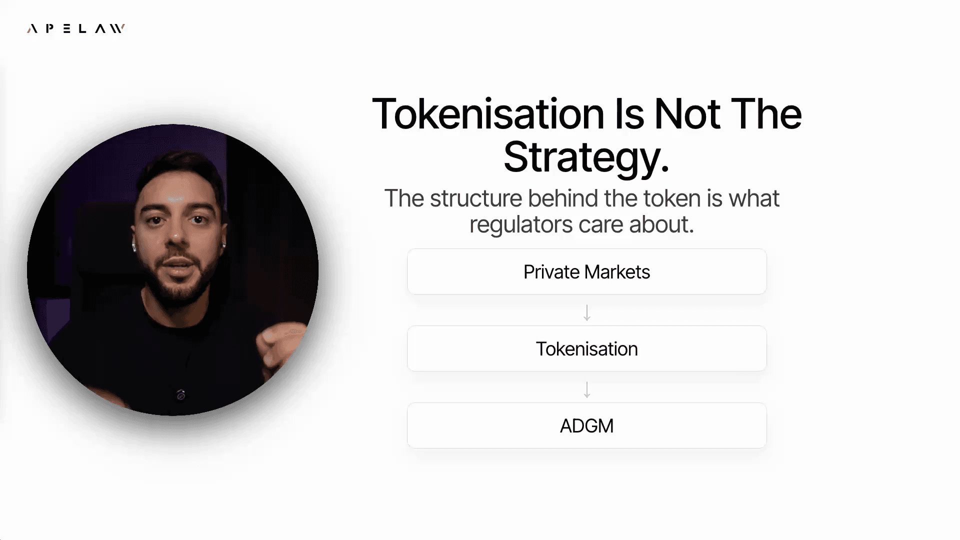
Published case-study diagram. Context: https://ape.law/case-studies/tokenization-should-not-start-with-token
Published case-study diagram. Context: https://ape.law/case-studies/web3-commercial-dispute-evidence-strategy
Published case-study diagram. Context: https://ape.law/case-studies/web3-dao-token-legal-infrastructure
Existing website font. Verify the font licence before redistribution, embedding in another product or use outside the website.
Existing website font. Verify the font licence before redistribution, embedding in another product or use outside the website.
Existing website font. Verify the font licence before redistribution, embedding in another product or use outside the website.
Existing website font. Verify the font licence before redistribution, embedding in another product or use outside the website.
Font files are supplied as existing website references. Verify their licences for use in another product or distributed template. This library does not grant rights to third-party names, logos, photography or testimonials.
14 / KEEP IT CONSISTENT
Use this guide for presentation, the original components for behaviour and the relevant published pages for facts. A specific owner-approved brief can override a rule for that deliverable.
When the system changes, update the guide, its version and its machine-readable files together. This guide’s date records a brand-system revision, not a legal review of every linked page.